As part of my Art Direction role at Publicis I worked closely with Rogers, a Canadian communications and media company. I collaborated in multiple projects during my stay at Publicis this is the latest campaign I did with them. In Quebec there's a specific day to switch homes, we call it moving day. Rogers decided to leverage this opportunity to convince clients to switch companies. Publicis was asked to create acampaign that would speak to the local population, this campaign had to be french firs
Year: 2025
Art Direction: Maria Montiel

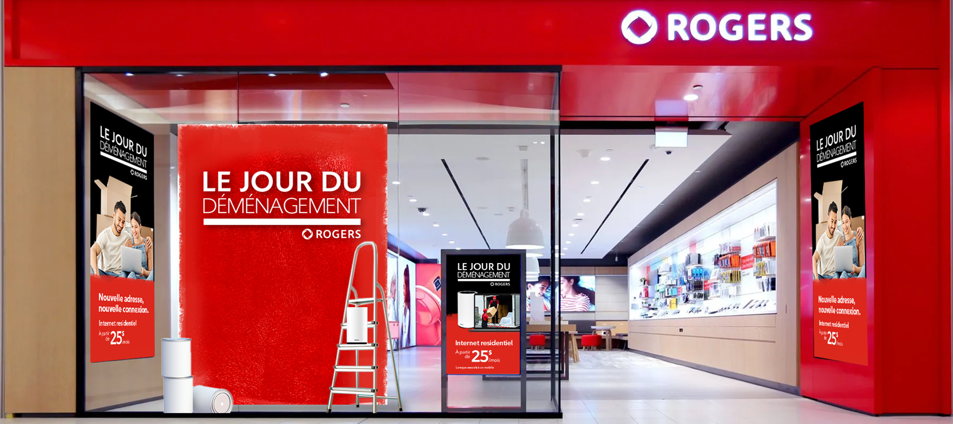
This concept uses the renovation insight of moving to a new home. The paint texture is used as a way to communicate changing colors from a past supplier and replacing them for the rogers colors. It's a visual hint for the audience to replace the old for something bright and new, similar to changing apartments.
Red paint as a ROGERS visual code.
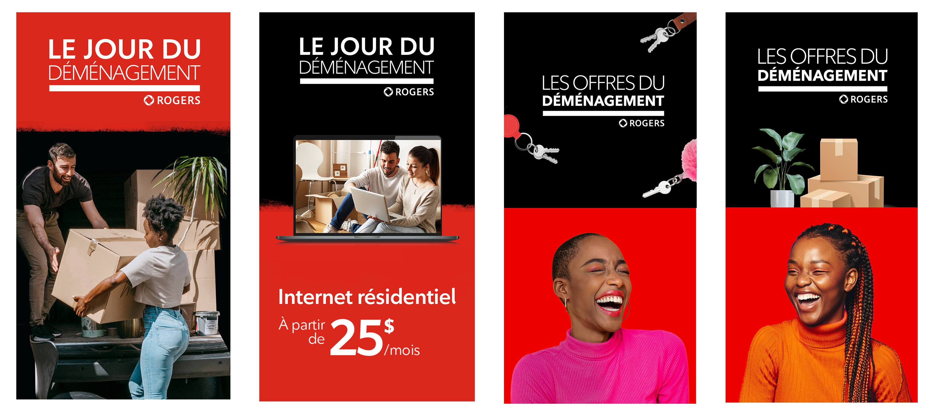
As part of the creative process, we tested a lot o visual cues referig to moving day like boxes, keys, and different types of lifestyle imagery. I went to avariu rounds of proposals to nail th best concept.
Following the visual identity of the brand, the banners feature the brand's colors and lifestyle imagery that not only represent genuine expressions, they also leverage the coded of moving like carrying boxes, eating pizza, etc.
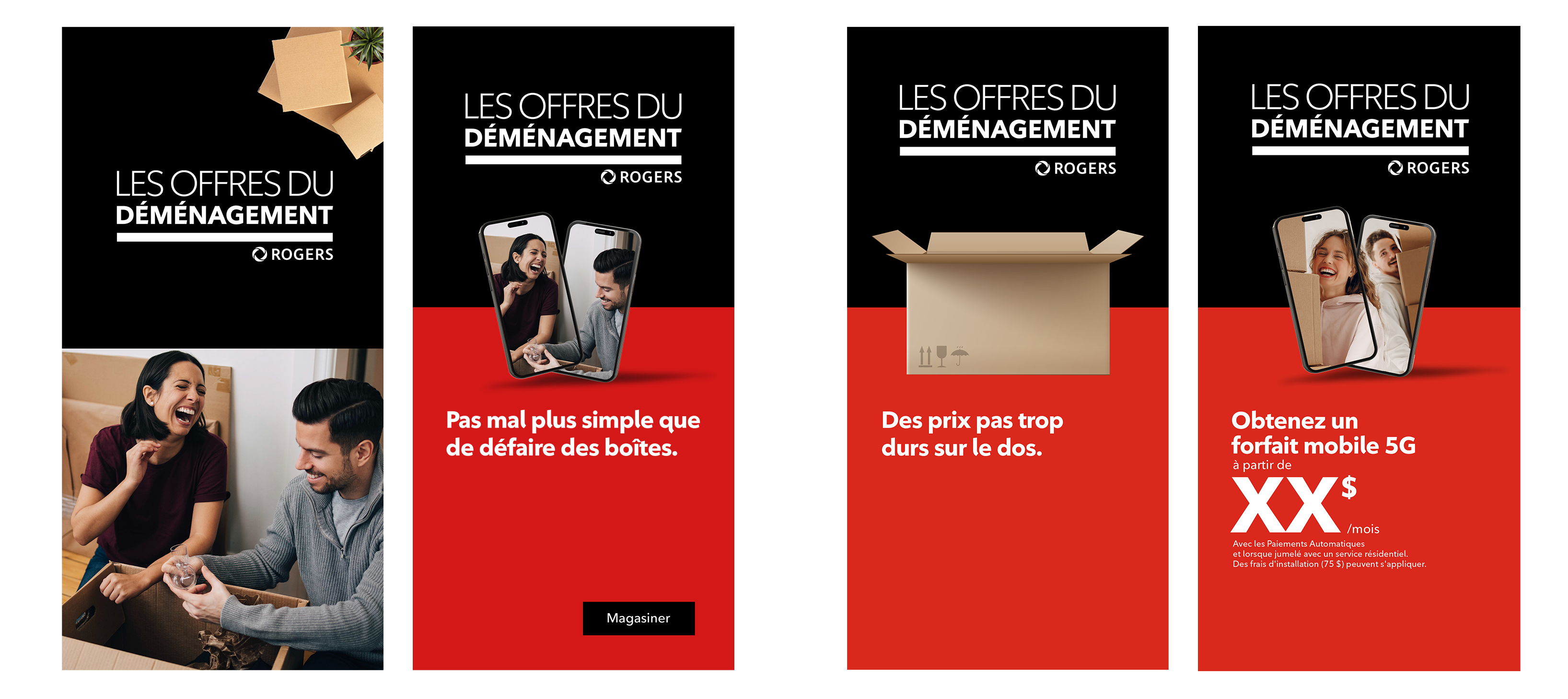
I created a set of dynamic and static banners that are available on multiple digital platforms as meta, pinterest and youtube.
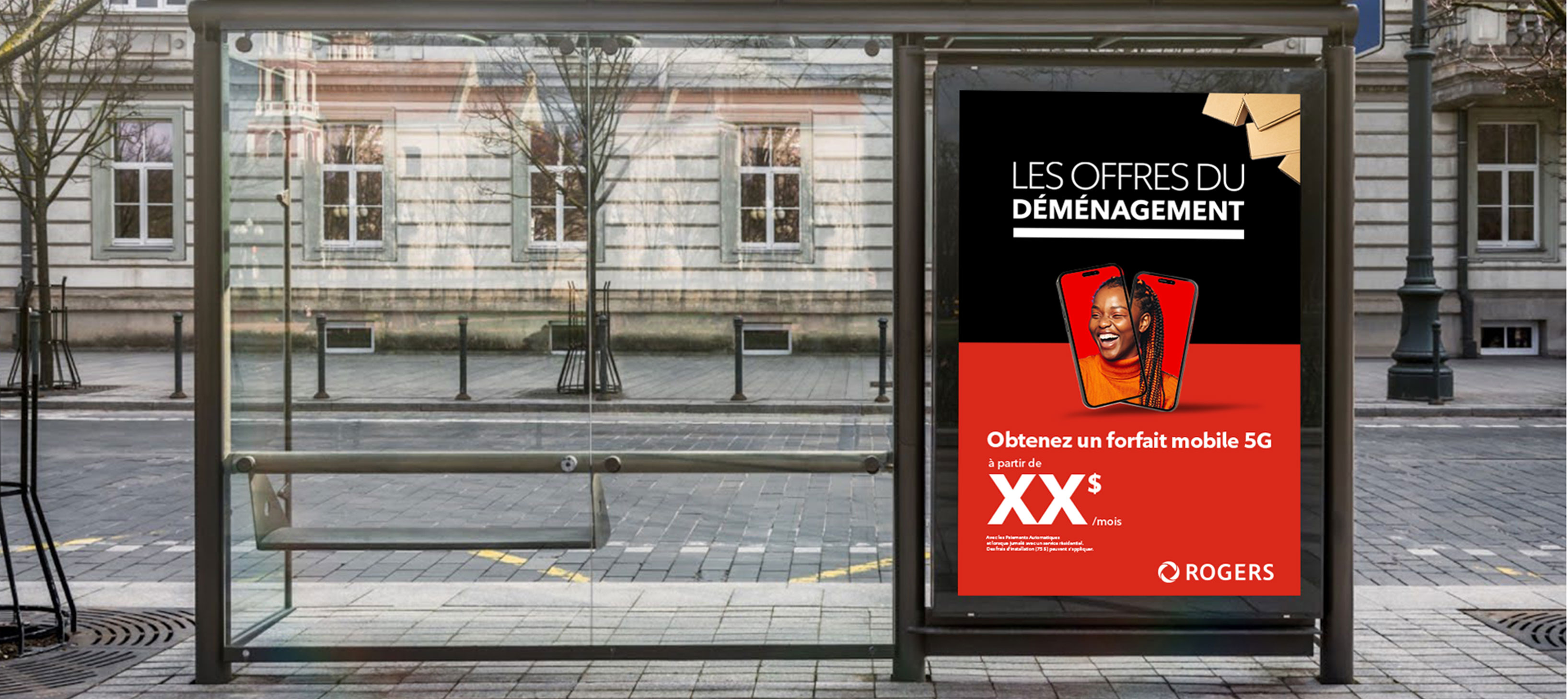
This campaign included printed pieces as posters for buss stops and street posting. The web banner concepts were also adapted for printed media.
We proposed to use the ROGERS trucks as moving billboards to annoying the offer big and bold.